
1 / 4
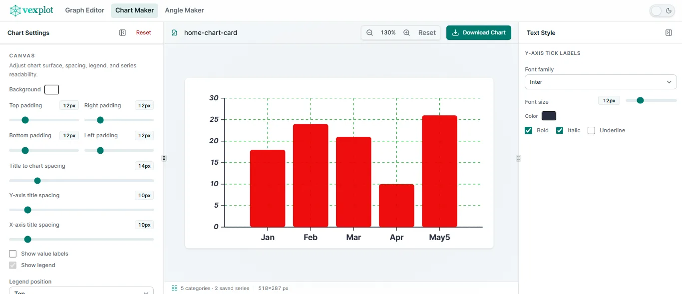
Single-series bar charts
Turn one set of category values into a focused comparison with editable axes, labels, spacing, colours, and value display.

Build editable bar and line charts directly in your browser. Enter categories and values, refine the labels and styling, then export a clean chart for a worksheet, presentation, or report.
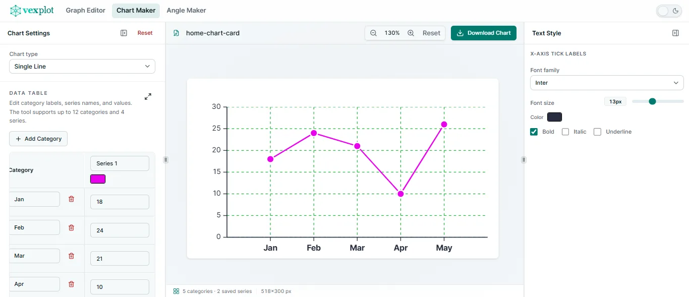
Use bar charts for clear category comparisons and line charts for simple trends across evenly spaced categories.
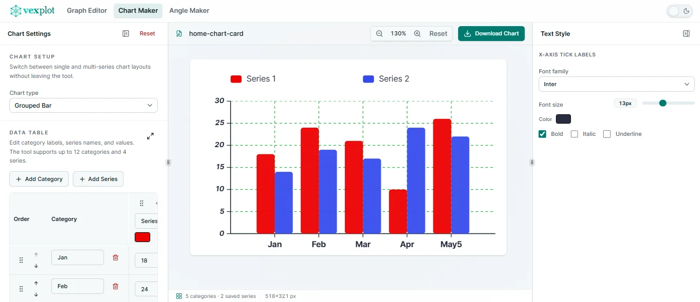
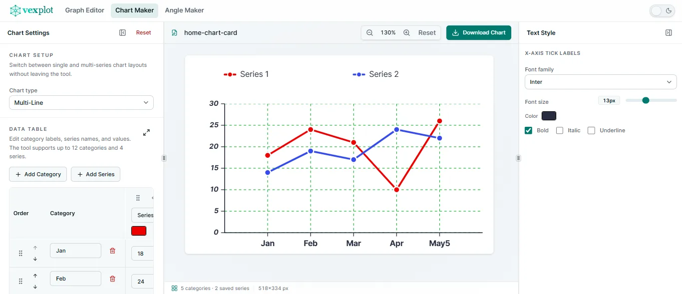
Use one editable category dataset for a focused single series or a multi-series comparison, then switch between bar and line presentations.
Keep the workflow focused: enter the numbers, choose the chart type, and make only the presentation adjustments you need.
Rename categories, edit values, and add up to four series directly in the workspace. Your data remains available when you switch chart types.
Use a readable automatic scale or set a manual y-axis range. Adjust spacing, tick labels, grids, and category-label rotation.
Set chart and axis titles, series colours, bars, lines, grid styling, legend placement, value labels, and background colours.
Keep categories, series, and axes easy to read with chart titles, axis titles, legends, and configurable label display.
Even x-axis spacing keeps categories easy to compare, whether you are showing a classroom survey or a simple grouped dataset.
Download scalable SVG charts or PNG images for worksheets, presentations, documents, and quick sharing.
Keep multiple named charts in the Vexplot Library, then reopen and edit them later in this browser. Download a portable .vexplot file when you want to keep a separate copy or open it in another browser. There is no account or cloud sync.
Make a concise chart for a lesson, a document, or a quick explanation without needing a heavier data workflow.
Add categories and values, select the right chart type, then save the chart to your Library or export it.
Useful details about chart types, data controls, saving, and export formats.
Chart Maker creates single and grouped bar charts, plus single and multi-line charts, from categorical data.
Yes. Add up to four data series and compare them across as many as 12 evenly spaced categories.
Yes. Edit category and series data, titles, colours, y-axis settings, grid styling, legends, value labels, and category-label rotation.
Yes. Save multiple named charts to the local Vexplot Library and reopen them for editing. You can also download and open portable .vexplot files.
Yes. Export a scalable SVG or a PNG image for worksheets, presentations, documents, and websites.
No. The editor works without an account. Drafts and Library documents stay in the browser on this device, with no cloud sync.